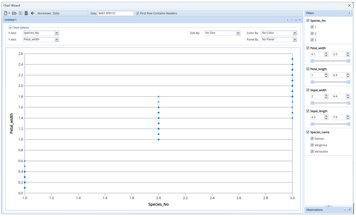
The example below illustrates the use of Analytic Solver Data Science’s chart wizard in drawing a Scatterplot using the Iris.xlsx dataset. Click Help – Example Models on the Data Science ribbon to open the example dataset, Iris.xlsx from Forecasting/Data Science Example Models. Select a cell within the dataset, say A2, and then click Explore – Chart Wizard on the Data Science ribbon. Select Scatter Plot.
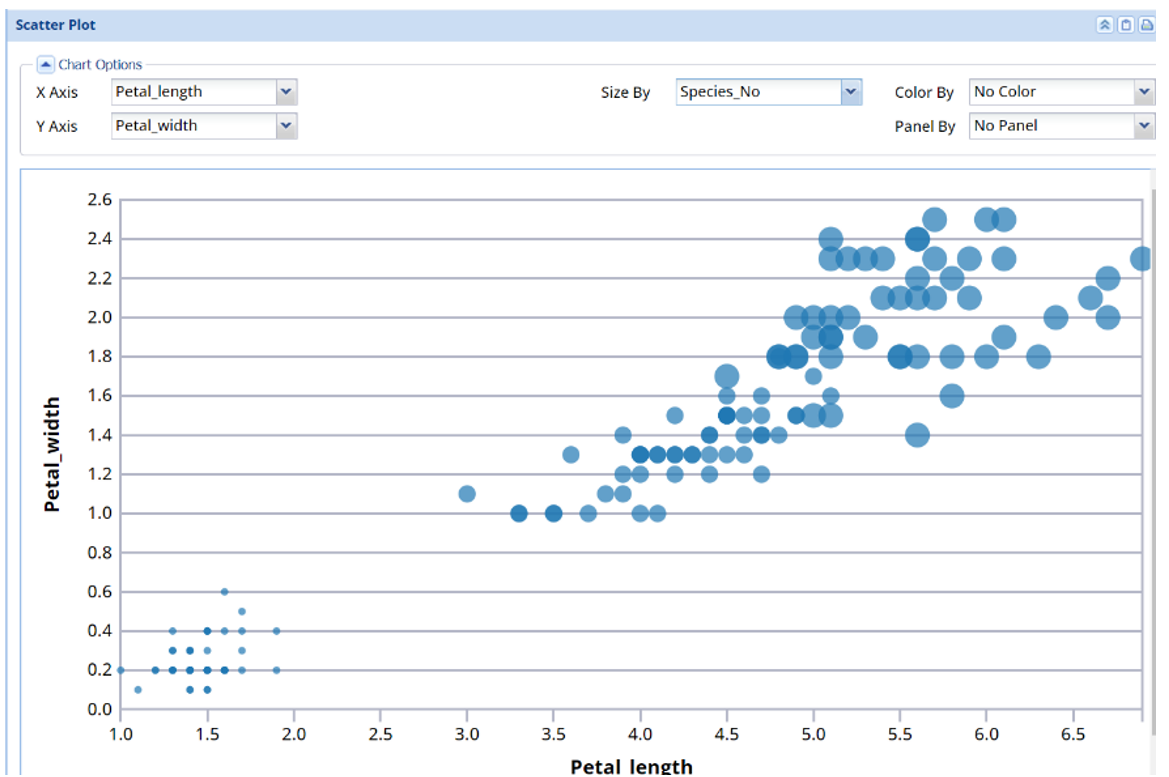
Note that the graph shows that Iris flowers with small, medium or large pedal widths belong to the same Iris species.
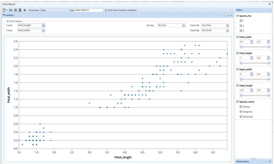
Click the down arrow next to X Axis (at the top, left) and select Petal_length from the menu.
Notice that Iris flowers with small, medium or large pedal widths generally have the same (small, medium or large) pedal lengths.
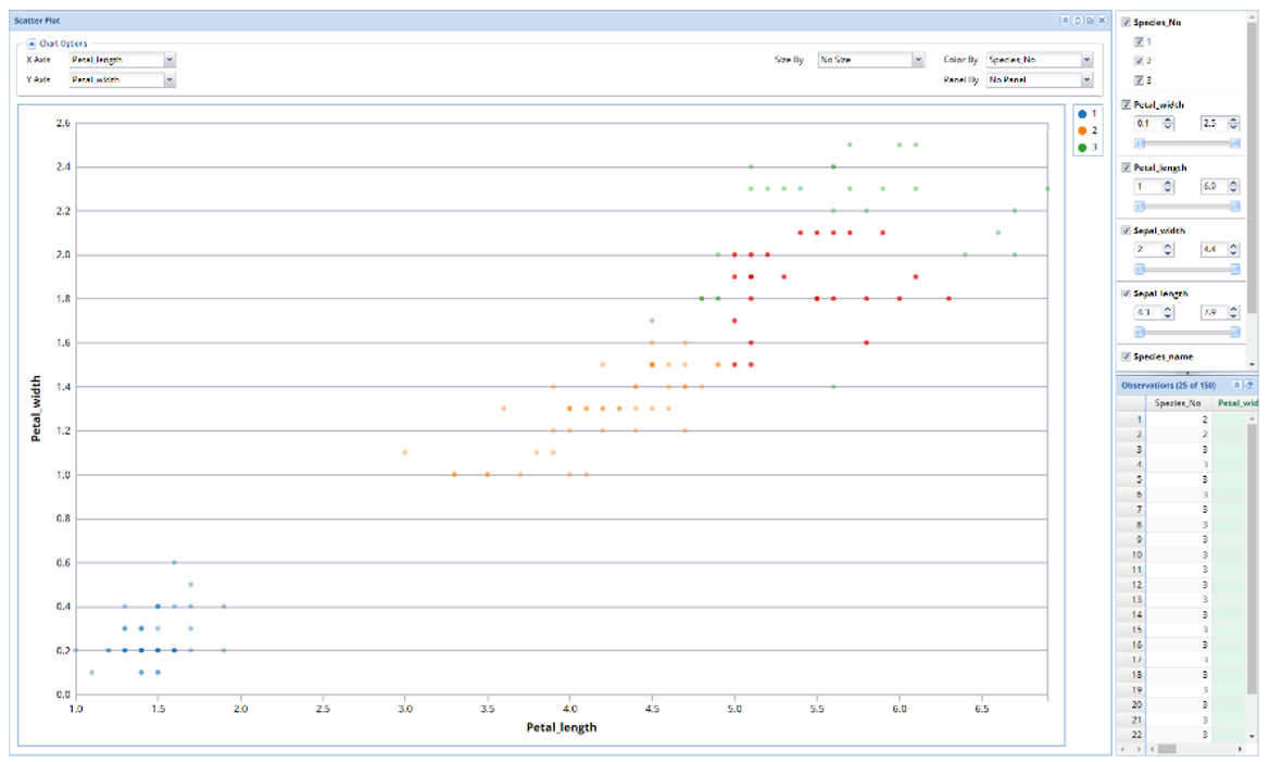
Click the down arrow next to Size By and select Species_No. Now the chart clearly shows which data points on the chart belong to each species.
This chart clearly shows that, out of the three varieties of iris flowers, the Setosa variety has the smallest petal widths and lengths, the Verginica has the latest petal widths and lengths and the Versicolor variety is in between the Setosa and Verginica.
Alternatively, select the down arrow next to Color By and select Species_No to color each data point by species type.
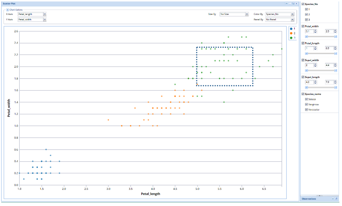
Click Observations on the bottom right to open the Observations pane. Then use the mouse to draw a square in the middle of the data points. The data points contained within the square immediately appear in the Observations pane. Move the bottom scroll bar to the right to view all data for each record in the dataset.