Introduction
Analytic Solver Data Science provides eight various types of charts to visually explore your data: Bar Charts, Line Charts, ScatterPlots, Boxplots, Histograms, Parallel Coordinates, ScatterPlot Matrices, and Variable Plots. To create a chart select Explore - Chart Wizard. A description of each chart type follows.
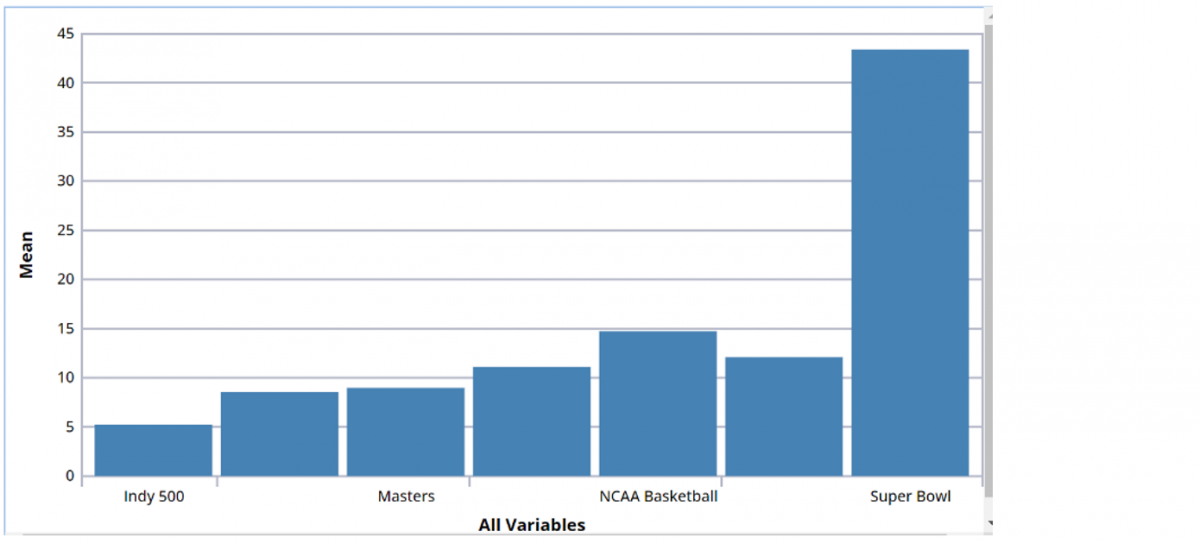
Bar Chart
The bar chart is one of the easiest plots to create. The best application for this type of chart is comparing an individual statistic (i.e., mean, count) across a group of variables. The bar height represents the statistic, while the bars represent the different variable groups. Following is an example of a bar chart.
Box Whisker Plot
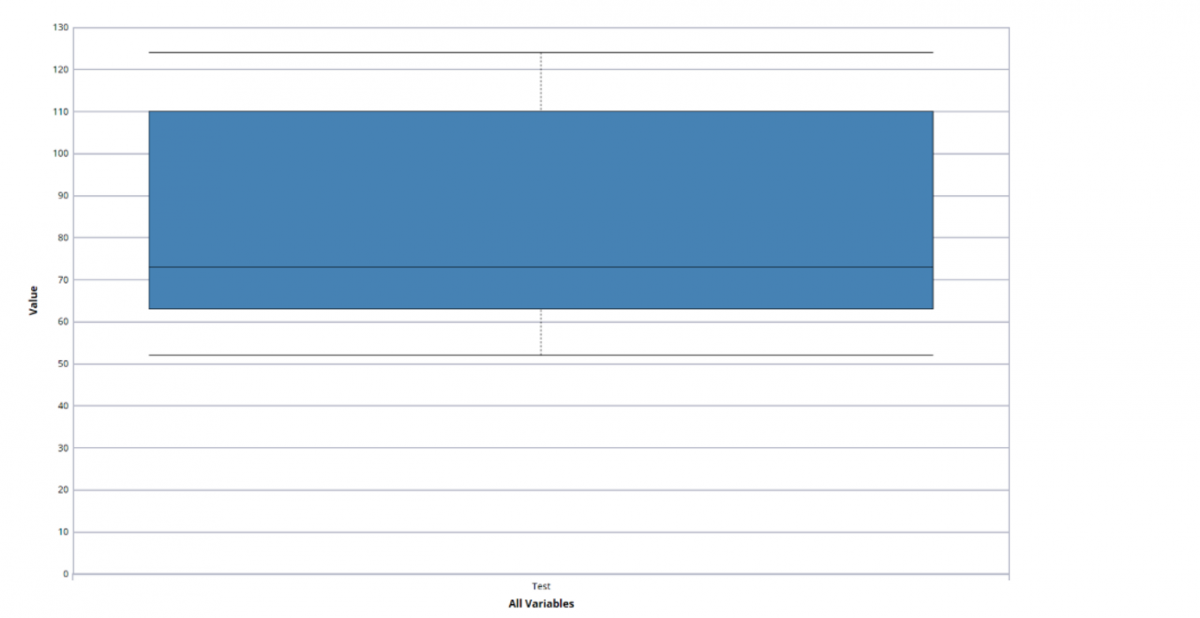
A box plot graph summarizes a dataset and is often used in exploratory data analysis. This type of graph illustrates the shape of the distribution, its central value, and the range of the data. The plot consists of the most extreme values in the data set (maximum and minimum values), the lower and upper quartiles, and the median.
Box plots are very useful when large numbers of observations are involved or when two or more data sets are being compared. In addition, they are also helpful for indicating whether a distribution is skewed and whether there are any unusual observations (outliers) in the data set. The most important trait of the box plot is its failure to be strongly influenced by extreme values, or outliers.
A box plot includes the following statistical features.
Median: The median value in a dataset is the value that appears in the middle of a sorted dataset. If the dataset has an even number of values then the median is the average of the two middle values in the dataset.
Quartiles: Quartiles, by definition, separate a quarter of data points from the rest. This roughly means that the first quartile is the value under which 25% of the data lie and the third quartile is the value over which 25% of the data are found. (Note: This indicates that the second quartile is the median itself.)
First Quartile, Q1: Concluding from the definitions above, the first quartile is the median of the lower half of the data. If the number of data points is odd, the lower half includes the median.
Third Quartile, Q3: Third quartile is the median of the upper half of the data. If the number of data points is odd, the upper half of the data includes the median. See the following example.
Consider the following data set --
52, 57, 60, 63, 71, 72, 73, 76, 98, 110, 120, 121, 124
The data set has 13 values sorted in ascending order. The median is the middle value (i.e., 6th value in this case).
Median = 73
Q1 is the median of the first 7 values.
25th Percentile = 63
Q3 is the median of the last 7 values.
75th Percentile = 110
The mean is the average of all the data values ((52 + 57 + 60 + 63 + 71 + 72 + 73 + 76 + 98 + 110 + 120 + 121 + 124) / 13)
Mean = 84.38
Interquartile Range = 47 The Interquartile range is a useful measure of the amount of variation in a data set and is simply the 75th Percentile - 25th Percentile (110 - 63 = 47)
The box extends from Q1 to Q3 and includes Q2.
The median is denoted with a solid line through the box.
The "whiskers" denote the extreme range of the data, not including any outliers.
Min range: 25th percentile - 1.5 * IQR
Max range: 75th percentile + 1.5 * IQR
Outliers are denoted by a circle.
Min: 52
Max: 124
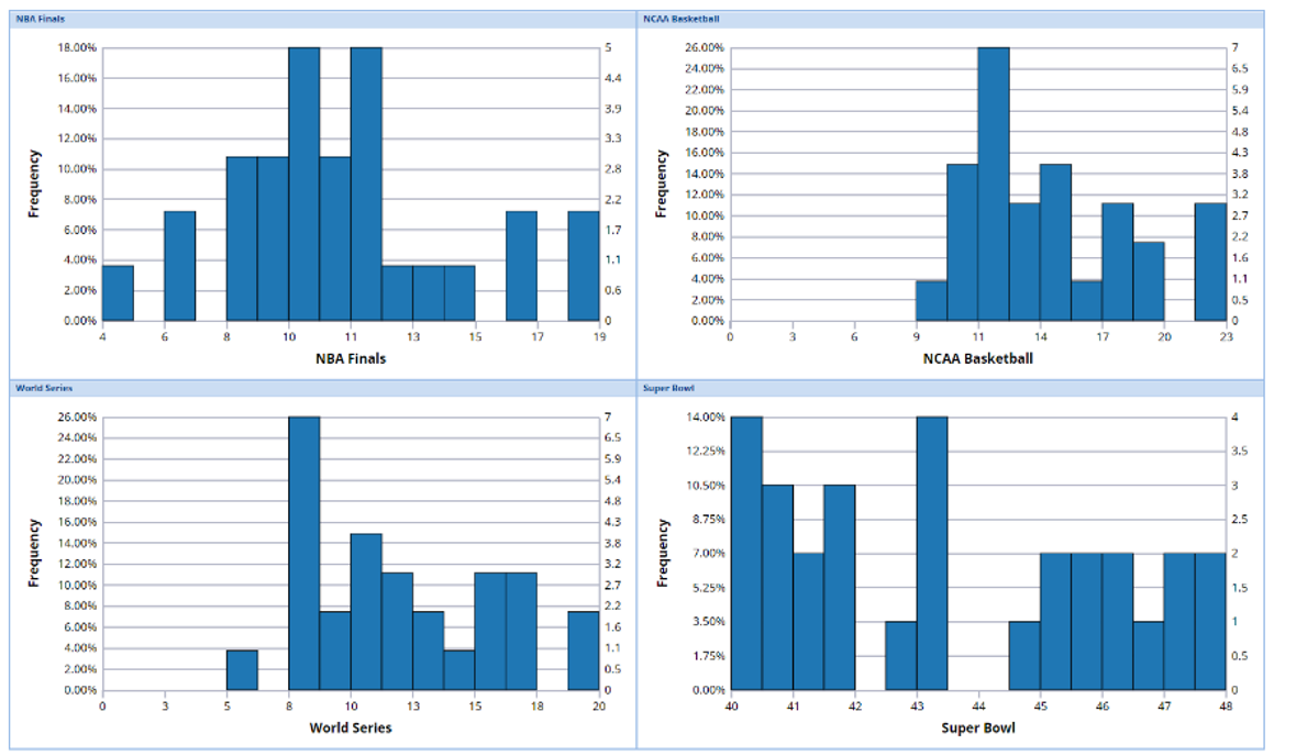
Histogram
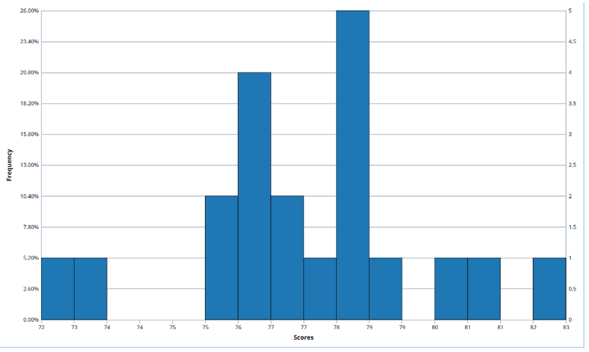
A Histogram, or Frequency Histogram, is a bar graph that depicts the range and scale of the observations on the x axis, and the number of data points (or frequency) of the various intervals on the y axis. These graphs are popular among statisticians. Although these graphs do not show the exact values of the data points, they provide a good idea about the spread and shape of the data.
Consider the percentages below from a college final exam.
82.5, 78.3, 76.2, 81.2, 72.3, 73.2, 76.3, 77.3, 78.2, 78.5, 75.6, 79.2, 78.3, 80.2, 76.4, 77.9, 75.8, 76.5, 77.3, 78.2
One can immediately see the value of a histogram by taking a quick glance at the graph below. This plot quickly and efficiently illustrates the shape and size of the dataset above.
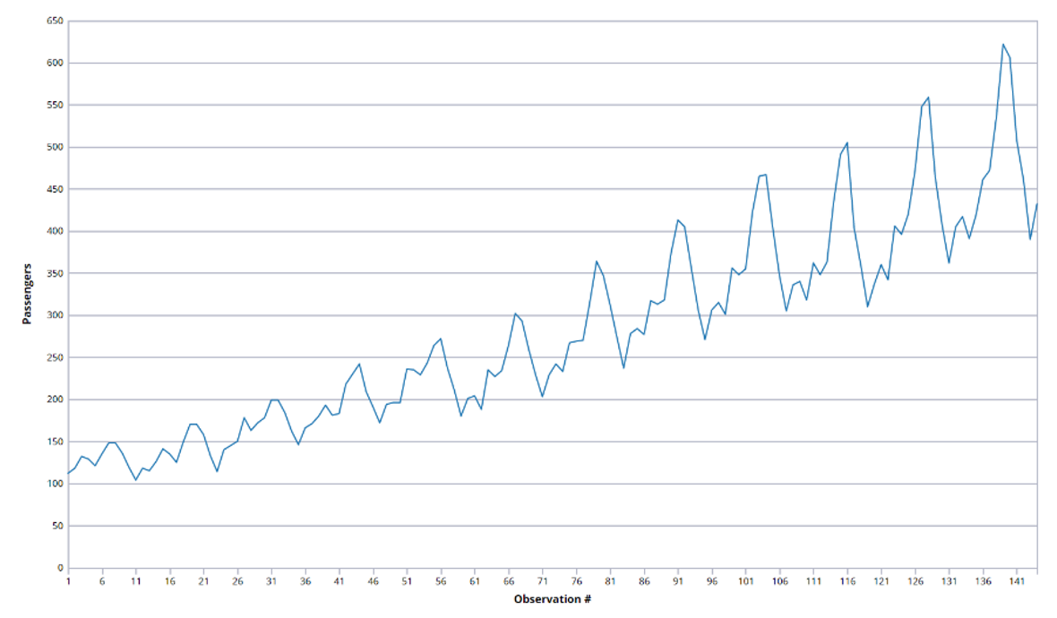
Line Chart
A line chart is best suited for time series data sets. In the example below, the line chart plots the number of airline passengers from January 1949 to December 1960, where the x axis represent the number of months starting with January 1949 as 1.
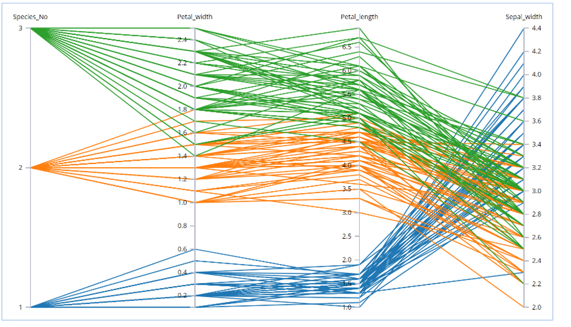
Parallel Coordinates
A Parallel Coordinates plot consists of n number of vertical axes where n is the number of variables selected to be included in the plot. A line is drawn connecting the values for observations for each different variable (each different axis) creating a multivariate profile. These graphs can be useful for prediction and possible data binning. In addition, these graphs can expose clusters, outliers, and variable overlap. Axes can be reordered by simply dragging and moving the axis to the desired location. Following is an example of a Parallel Coordinates plot.
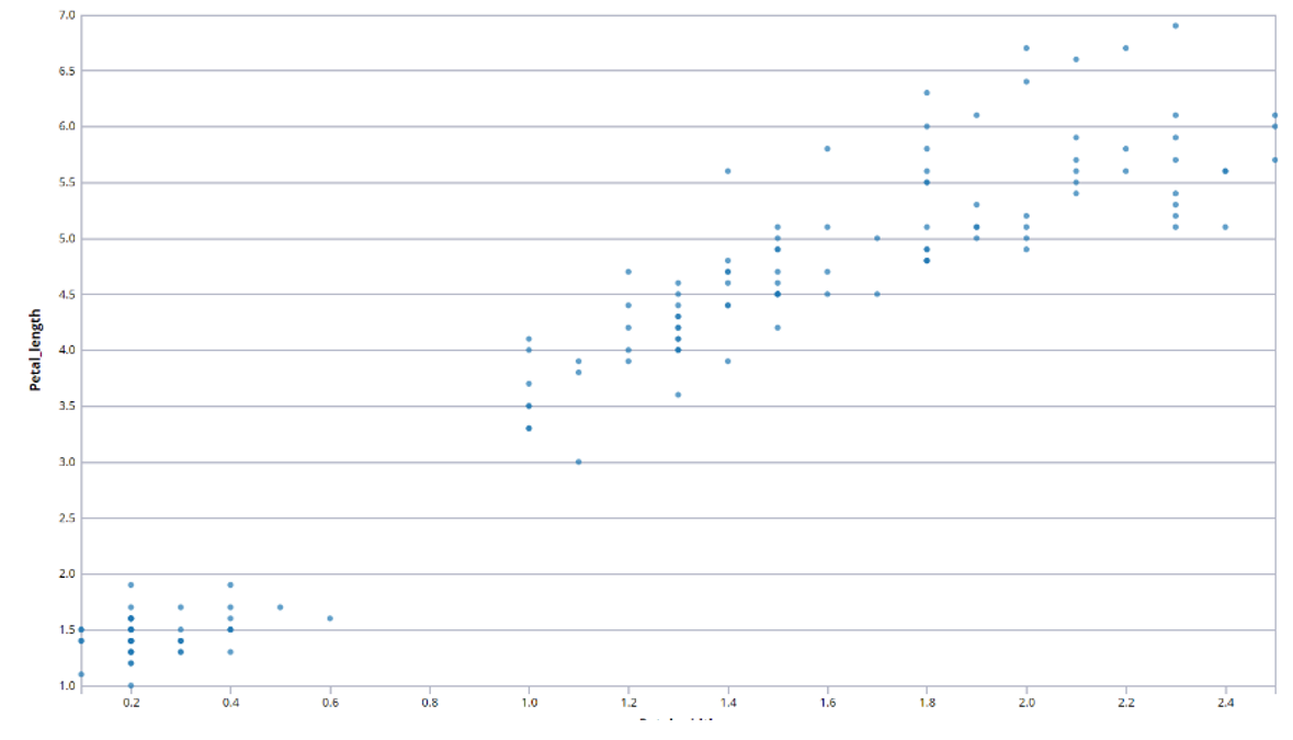
Scatterplot
One of the most common plots is the Scatterplot. These graphs are used to compare the relationships between two variables, and are useful in identifying clusters and variable overlap.
Scatterplot Matrix
A Scatterplot Matrix plot combines several scatterplots into one panel to see pairwise relationships between variables. Given a set of variables Var1, Var2, Var3, ...., Var N the scatterplot matrix plot contains all the pairwise scatterplots of the variables on a single page in a matrix format. The names of the variables are on the diagonals. In other words, if there are k variables, there will be k rows and k columns in the matrix, and the ith row and jth column will be the plot of Vari versus Varj.
The axes titles and the values of the variables appear at the edge of the respective row or column. The comparison of the variables and their interactions can be studied easily,which is why scatterplot matrix plots are becoming increasingly common in general purpose statistical software programs. Following is an example of a scatterplot matrix.
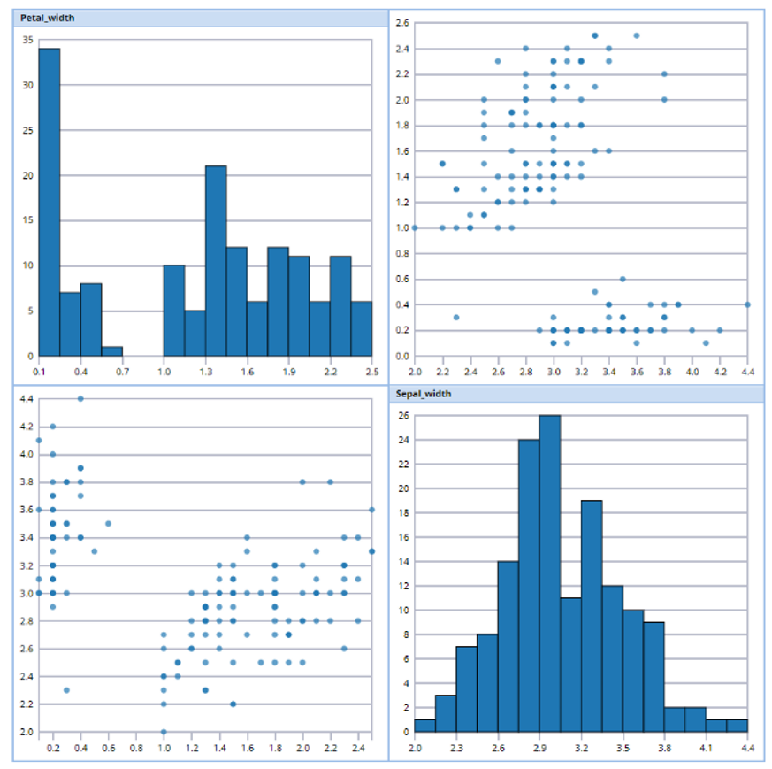
Variable Plot
Variable plots simply plot the distribution for each selected variable. Following is an example of a variable plot.