See below for documentation on all chart options.
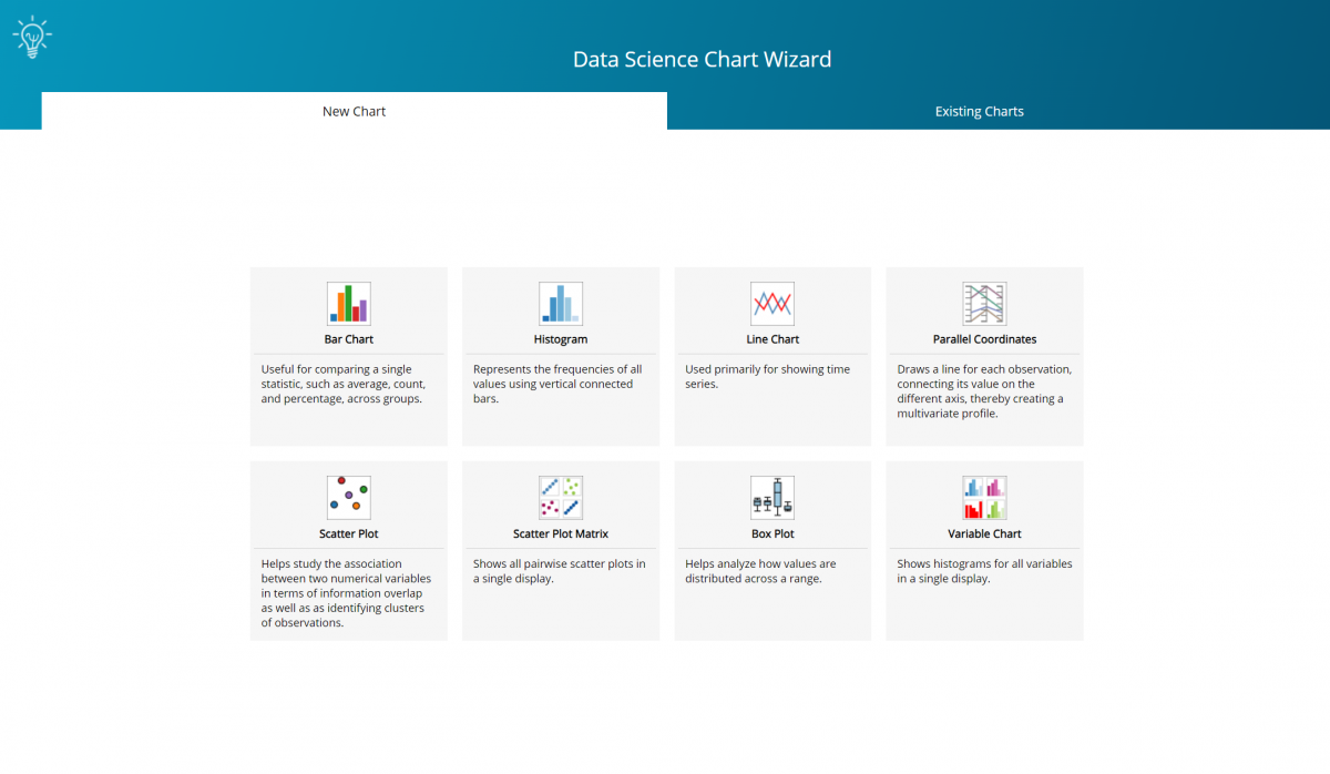
Click Explore – Chart Wizard to open the Chart Wizard.
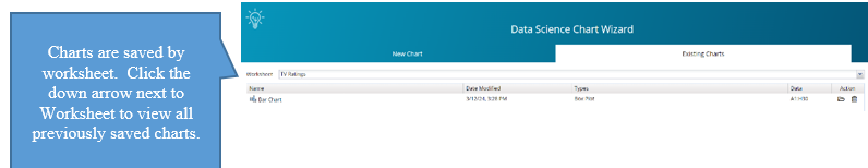
To open a previously saved chart, click the Existing Charts tab and then select the desired chart.
The following bar appears at the top of each chart. From here, you can open a new or existing chart, save the current chart, go back to the chart selection dialog or change the data range.
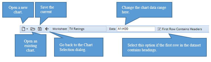
Note on opening a chart: When a single cell is selected that is located inside or adjacent to a dataset, the entire dataset will be used for the “Data” cell range. If the user has selected multiple cells in a single rectangular region, those cells, excluding any bounding empty cells, will be used for the “Data” cell range. This behavior was added to allow users to create a chart on a subset of a worksheet dataset without the User being forced to edit the Data address after the chart has been created.
Note on chart changes: Chart changes are tracked. Show confirm dialogs will be displayed when going back, closing or opening an existing chart when the current chart has been changed. The chart title will display an * when unsaved changes have been applied to the chart.
Use the icons on the top right of the chart to :

- Collapse the current chart while keeping it open.
- Copy the current chart to the clipboard. Note: Mozilla’s Firefox web browser uses a default configuration that does not allow images to be copied to the clipboard. This configuration may be changed by navigating to about:config, within Firefox, and setting dom.events.asyncClipboard.clipboardItem to True.
- Send the current chart to the printer.
- Close the current chart window.
Chart Options Pane
The following options may appear within the Chart Options pane in each chart.
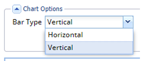
The following option appears only with bar charts.
Bar Type: Select the Bar Type: Vertical or Horizontal. This option only appears when a bar chart is created.
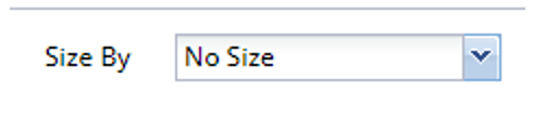
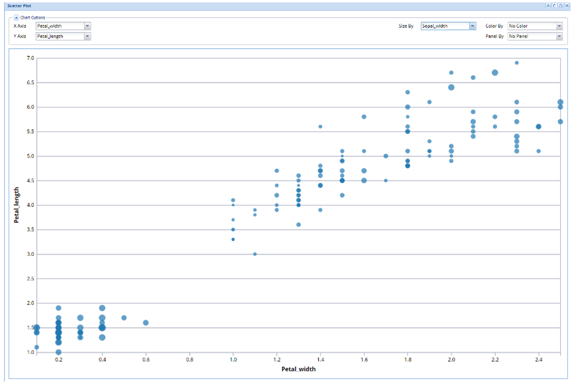
The following option appears only with Scatterplot Matrix charts.
Size By: Click the down arrow to select a variable to determine the size of the points on the chart. In the chart below, for example, the size of the dots are determined by the size of the Sepal_width for each record in the dataset. This option appears in a scatter plot.
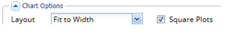
The following two options appear on Scatterplot Matrix charts.
Layout: Choose Fit to Width to fit the chart to the width of the chart dialog area. Select Fit to Page to fit all scatter plots onto the chart dialog area.
Square Plots: Select this option to generate square scatter plots. Uncheck this option to generate rectangular scatter plots.
The following option appears on two chart types: parallel coordinates, scatterplot matrix and variable.
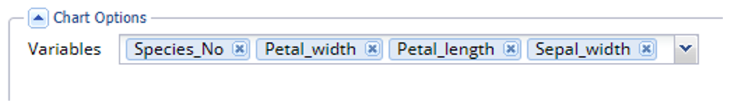
Variable Tag Field: Click the down arrow to select a variable to include in the chart. Click the x in the upper right of the variable tab to remove the variable from the chart.
The following option appears on histogram and variable charts.
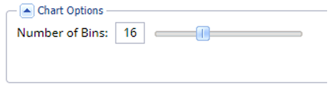
Number of Bins: Use the slider to increase or decrease the number of bins.
The following options appear on the following chart types: bar, box plot, histogram, line, scatter plot and variable.
X Axis: Click the down arrow select the variable(s) to appear on the x-axis.
YAxis: Click the down arrow to select the metric to appear on the y-axis.
The following options appear on all charts.
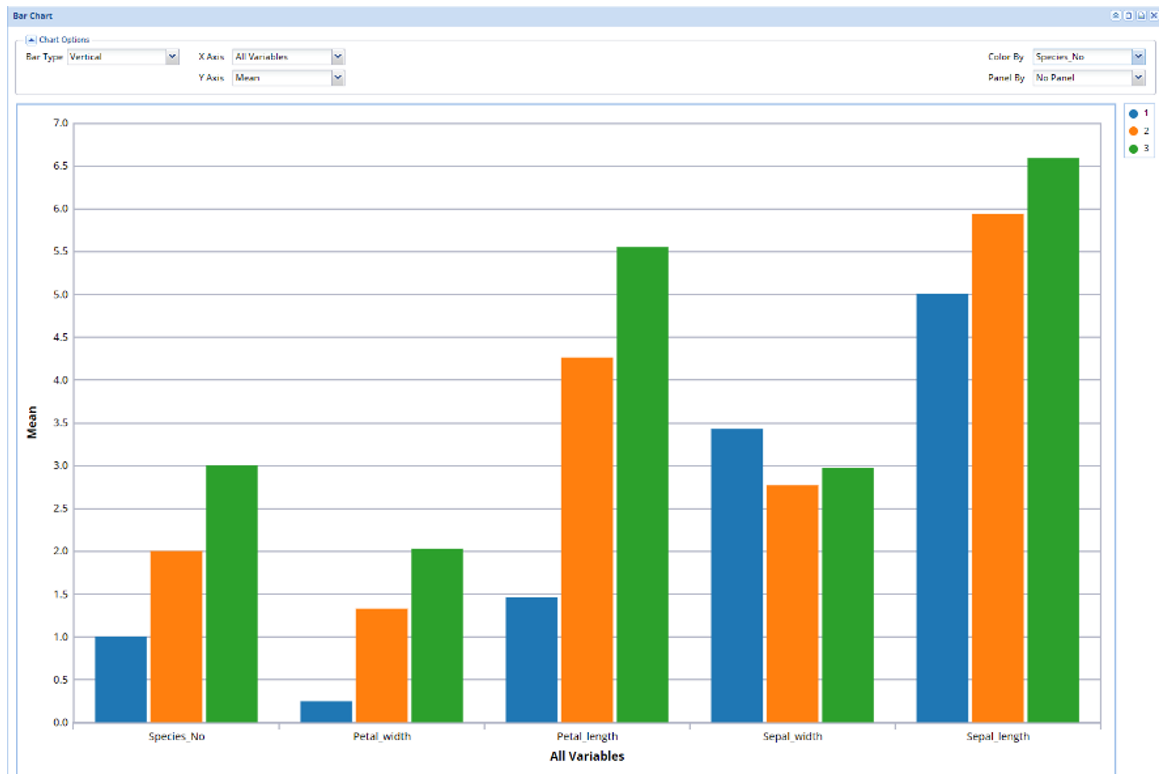
Color By: If the dataset contains categorical variables, click the down arrow next to Color By to display the data by category. A different color will be applied to each category, as shown below.
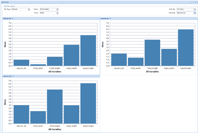
Panel By: If the dataset contains categorical variables, click the down arrow next to Panel By to display the data by category in separate charts. Each category will be displayed in a separate chart, as shown below.
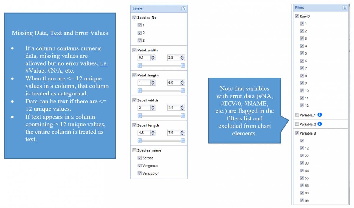
Filters Pane and Data Requirements
Use the Filters pane to add and remove variables when a Variable Tag Field is not present. (For more information on the Variable Tag Field, see below.
Uncheck the variable to remove from the chart. Select to include in the chart. The data range may be altered by clicking the up an down buttons on the spinner fields or by moving the sliders left (to decrement) or right (to increment).